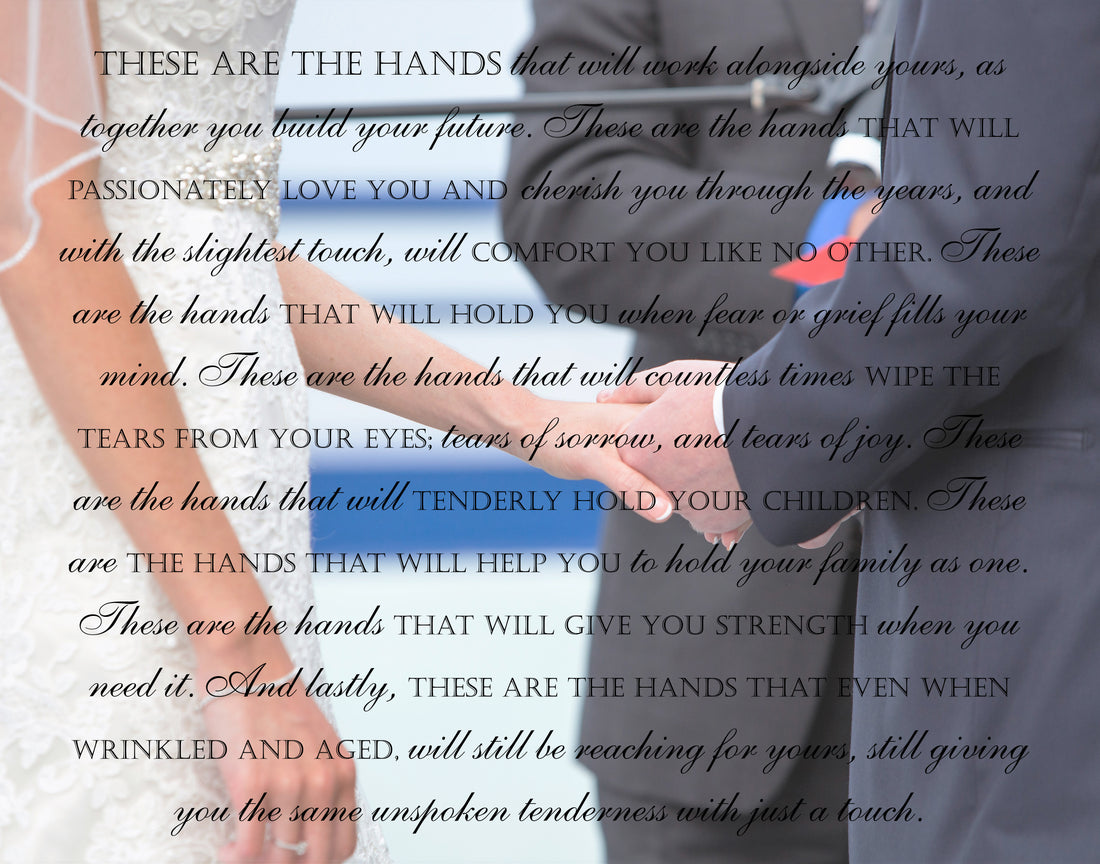
"What font type would you like?"
Share
One of the first questions you will probably hear from your designer is: "What font type would you like?" This one small question may seem impossible to answer. After all, its not like you sit pondering different typefaces in your spare time (yes, I lead a dull existence!) But seriously, font style is a big deal. It does a lot to convey the mood of a piece. And trust me, there are lots of moods, and lots of opinions too. And that's why I'll always ask.
That being said, it is fair to say that one might spend hours browsing the hundreds of thousands of font styles out there and still not settle on "the perfect font". And that's where I come in.
Font Options In A Nutshell
I'm going to list popular design themes - or as some may interpret them - moods, that you may want your canvas design to convey:
- romantic
- whimsical
- formal
- distinguished
- playful
- sentimental
- grungy
- distressed
- retro
- old fashioned
- vintage
- masculine
- casual

Next let's talk about popular font types (also referred to as "families"):
- scripted
- calligraphy
- handwritten
- cursive
- serif
- sans serif
- blackletter & lombardic scripts
- decorative
- casual brush
- glyphic
- square
- transitional
- neoclassic
Almost everyone recognizes New Type Roman. I'm sure you've heard of Arial font. How 'bout Helvetica? Okay, Helvetica might be pushing it, but the gist of these three is that they are all what I will refer to as "printed fonts".
Here's another that you probably know: Lucinda handwriting. Just about everyone using a keyboard these days has seen that one on the little font choice drop down menu. So there's (yes, I'm stating the obvious!) an example, albeit a lame one, of handwriting font. Most of us are old enough to remember that handwriting/cursive letters connect to each another to form a word all in one single stroke.
Script can be often mistaken for handwriting, In fact some consider them one in the same. Just keep in mind that script fonts look similar to cursive except the letters are normally separate entities. Lucinda script is a good example of this.
I'm going to leave you on your own to look into the other types/families out there but I think it's safe to assume that most of us want one of three types. Scripted, cursive or printed.
Where Style Comes In
Yes, we are finally getting to the fun part!
My favorite designs have at least 3 different font types. Sound busy? It can be, but normally its the opposite. Using alternating font types and sizes even helps break up the monotony of traditional paragraph form and adds artistic flair if done properly. We may even use one font but display it in caps in one line, or bold in another, while the rest maintains uniformity. The whole idea is to draw the eyes to a certain point, and if the words are the primary focus of the design, we can use these font "switch-ups" to help us lead the viewer to the most important parts of your wording.
One of the things that drew you to my store is most likely the style of one of my designs. If you have had time to browse my listings/canvas designs, you will notice that quite a few have a distinct style. Style happens when we take our chosen theme or mood and work the font type/family into the design to enhance that mood.
Style relies heavily upon word placement too. For example, do you want your photo with words to be more about the photo or more about the wording?
Do you want the photo to serve as the backdrop or do you want the words to do that instead, giving the subject matter in the photo prominence over the message delivered by the text?
No Easy Answer, But Your Designer is Easy to Work With
So let's recap.
- thousands of font options available (check out fontspace.com for some examples)
- mood, and style play a large role in determining font type
- I'll make this painless (after all, this is MY job!)


